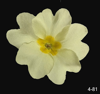
Due to the time of year, for this study I chose the primrose. It has so many memories for me of Spring at Baldwin on the Isle of Man, with its banks blanketed in yellow flowers. Due to the Covid restrictions I missed them this year but those in our garden are doing their best to make up for this. Memories too of the daily walk to and from the station suddenly taking on a freshness as the primroses sprang up on the verges.
Some interesting facts - the primrose, Primula Vulgaris, takes its name from primus - first and vulgaris - common and was first coined by William Hudson in Flora Angelica published in 1762. The vernacular term primrose is derived from the Latin prima rosa - the first 'rose' of the year. Primrose day is the 19th April. In the language of flowers, the primrose is the flower for lovers and is interpreted as 'I can't live without you'. It symbolises youth.
As my design process progressed I realised this probably hadn't been the best choice as though it gave me colour, shape, pattern and texture, I could have chosen a flower that gave me more of all of these things. But equally I had them in abundance to study... and there is nothing like a challenge!
Using Photoshop Elements to produce images that relate to the stitch effects studied
A series of photos of primroses were taken from different angles until one was found that I thought would suit my purpose.
I decided to use 4-53, the primrose with the rain, and 'cut' this out using Photoshop Elements. Filters were applied that produced images related to the stitches/techniques already studied. Notes were made on the filters used and the adjustments needed to them to produce the effects shown.
4-54 speckling
4-55 speckling
4-56 wired needlelace
4-58 waste canvas
4-59
larger holed waste canvas
4-60
flap shape Hollie point
4-62 padded shape and flap shape
4-63
pattern darning, brick stitch
4-64 long and short stitch
A section of the primrose was used and the selection of filters was repeated looking for stitch potential. Again notes were made of the adjustments to the filter to achieve a result. I noticed that some filters took the abstraction too far and the essence of the primrose was lost.
4-66 section of the primrose
4-67
distressed Tyvek
4-71
or nue, underside couching, Sorbello Stitch, Eastern StitchDrawing to Study Your Flower
Drawings were produced from my digital imagery and also from picked flowers. Due to the simplicity of the structure of the primrose I found this section particularly difficult and kept continually asking myself 'what makes a primrose a primrose' so I would retain the essence of the primrose when I started producing decorated papers.
Initially I experimented with computer generated images but using more of the artistic filters. I also looked at how other artists had interpreted the primrose.
4-72 a different section of a wild primrose
4-73
accented edges
4-74
poster edges (love this)
4-75
posterisation (love this too)I looked at a wild primrose bloom:
4-79
accented edges
4-82
sketch palette knife
I looked at how other artists/designers, and indeed I, had used the primrose and included the most appropriate in my sketchbook 4-87/88.
Drawings/interpretations of my flowers were made, first with a couple of studies using Koh-i-Noor Aquarells and Inktense pencils and then line drawings followed by shading using an ink pen and Graphite Aquarelles 4-89 to 4-91.
Different silhouettes were studied - looking ahead to when I had to select a silhouette shape - 4-92.
Decorated Papers using Colour, Pattern and Texture from Drawing Studies
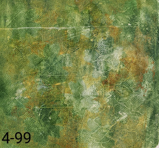
Coloured papers were produced using variously Koh-i-Noor dyes, thin bleach, Golden Open acrylic paints, a gelli plate, a hand made stencil of full-flowered primrose shapes and their cut outs, a primrose-shaped edge over which I stroked oil and chalk pastels, a plastic lace stencil, a silicon pastry brush, a wax pot and tjanting tools. Both tissue paper in various colours and white Seawhite wet strength paper (140gsm) were used. Some of the more successful papers are included here 4-93 to 4-108, the last being my favourite.
Finally an interesting silhouette shape was selected from my drawings. This evolved from all the above exercises.


No comments:
Post a Comment