Using a homemade gelli-plate the size of my sketchbook; Payne's Grey and Burnt Umber acrylic; a rigid plastic stencil in the shape of my stickman; a couple of textured plates - one of bricks and the other crazy paving - copy paper and Logan Wrap (a thin waxed paper), I had a session of gelli and monoprinting to produce suitable coloured papers to work with/monoprints. I also had some stickmen cut out that I could superimpose on backgrounds to provide quick colour comparisons.
I wasn't particularly happy with the results obtained from placing the stencil on the gelli plate and taking prints as the edge produced seemed very hard and lost the fluidity of the design. I'd cut the stencil with a blade and perhaps tearing it would have been preferable. I also used a paper stencil and though this gave better results it was still not ideal. Monoprinting the design by placing the textured object under the paper and rolling the ink on top produced a result with which I was happier.
When working with the papers, the design elements integrated better by once again cutting the elements out and placing them on a background rather than superimposing a pre-cut figure.
For the purpose of comparison, superimposing different coloured stickmen on different coloured backgrounds was a quick option, taking pictures as I went along. Some of the results are below - I won't bore you with all of them! I made the selection by looking at all the photos on the screen from a distance and chose those which seemed to jump out.


'Consider whether a dark or light background works better' - this thought occupied me for quite some time. I worked with just two colours - Payne's Grey and Burnt Umber, mixes from these and black paper. As I said, I looked at all the results on my laptop screen screen to see which jumped out. I still have difficulty deciding where black fits in to colour theory and so made my choices on strength of colour and contrast.
- MM257, MM258 and MM261 don't work for me as the contrast is too marked, probably due to too much strength of both colours and too much contrast.
- MM255, MM256 don't work as there is no contrast. Boring.
- MM259 is borderline. The stickman here is not doesn't have as much orange as the burnt umber and is receding.
- MM262 is borderline. The stickman is closer in colour to the Payne's Grey so integrates better with the background.
- MM260 works. The burnt umber makes the design 'pop'.
- MM254 works. The burnt umber makes the design 'pop' and traces of umber in the background help integrate the stickman.
MM263 - a gelliprint on Logan Wrap, I thought was worth including as the stickman repeat indicates movement. This would have been more marked if the two images on the left had been a fraction less heavy.

MM264 - When looking at the work of Antony Gormley I was reminded of work I did previously using an image editing program that had weather filters - so this is my street dancer in the frost designed using the Pentel brushpen on a gelliprint on Logan Wrap. Not particularly abstract but I could spend many happy hours interpreting this design with thin black thread in random cross stitch.

MM265 - I liked the simplicity of this. The rust coloured paper is from a wallpaper sample book and is superimposed on a gelliprint on copy paper. More movement would be obtained by having an increasing width between the lines. A possibility.

MM266 - The stickman has better integration into the design as I chalked him with white chalk to reduce the contrast. The paint mix of the gelliprinting on the right also helps to add some contrast.

MM267 - taking MM266 a little further and incorporating all the stickmen, and going back to my original objective of 'gulls with an emphasis on shadows', here we have 'stickmen with shadows'.

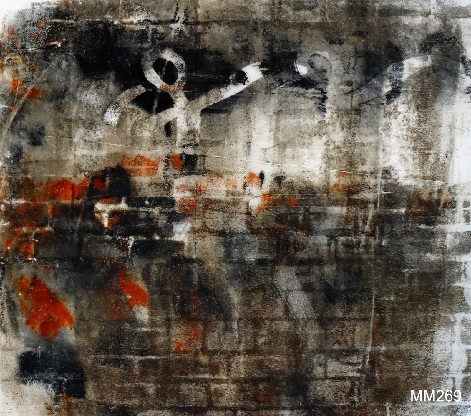
MM268 and MM269 additional designs.

MM270 - superimposed stickman.

MM271 - this was just a happy accident. After I had been taking photos I looked down and saw this arrangement which just appealed to me. It reminded me of the Bawden maypole (and Picasso's Dance of Youth), which is where this all started.

MM272 - gelliprint with superimposed sections. Referring to MM271 these could have been placed in a less structured way but there is fluidity, particularly in the legs.

To conclude this chapter, I haven't come up with anything concrete yet but ideas produced could lead to come interesting possibilities, particularly MM267, MM271 and MM272.