Diploma Module 1 Chapter 5 - Colour Study
To record the colours in my design, strips were cut from Image 2 and I attempted to reproduce the colours using different media. Until I started I had been worried that there was too little colour...unfounded. I took two strips, one including the beak and the red spot (always good when your work has one: bonus if someone else puts it on).
Image 172 - Just as there are many shades of grey, there are also many shades of white. The gull is definitely a bright white and almost shines.
Image 173 - For the second strip I made larger colour swatches which gave more surface area on which to build layers. Note that there are two swatches for the wall. Initially I used a base of ochre on which to build up layers. However, I felt a base of neutral grey replicated what happens in the real world. The lichen grows on the wall and not vice versa. This, I felt was more successful. The eye is pretty scary. I'll leave that colour for the time being.
Image 174 - Rather than take strips along the whole photo I include some earlier studies which look at the greys and blacks of the gull feathers. These are initial swatches, plus the red dot again.
I would like to have red and yellow in my colour scheme as these are the colours of the Manx flag, though they are both such dominant colours only one may be included in a final design. The pink from the legs doesn't work for me, but then pink rarely does.
From Image 172 and 173 I chose to work with seven coloured areas which I produced on paper, many as I had done in the observations:
- red - base - Koh-i-Noor Wax Aquarell red 6; layer - acrylic wax
- yellow - base - white matt vinyl emulsion; layer - Wax Aquarell yellow 4; light wash in places to spread colour
- blue - base - Inscribe acrylic Baltic Blue+snow acrylic; 1st layer - dry brush Baltic Blue; 2nd layer - dry brush Amsterdam Payne's Grey acrylic; 3rd layer - dry brush Windsor and Newton Phthalo blue acrylic - red shade
- wall - base - Daler Rowney neutral grey acrylic dabbed on with children's brush; 1st layer - Payne's Grey acrylicdabbed on; 2nd layer - Reeves Yellow ochre acrylic dabbed on
- leg ring - base - Payne's Grey acrylic+neutral grey acrylic+Seawhite's Seacryl white acrylic; layer - neutral grey acrylic+white acrylic
- grey section of gull - base - white acrylic; Layer - dry sponge neutral grey acrylic
- white section of gull - white acrylic heavily applied with distinct brush strokes.
Image 178 - Colours:
- graded in order from warm to cold. As black and white are not technically colours (black is all colours and white is the absence of colour) black was included as warm and white as cool.
- placed in order, top to bottom, of the proportion of the colour that appeared on the strips.
Image 179 - Pieces of each of the colours were placed on strips of each of the colours. From these samples my preferred backgrounds are the blue and the grey as they peacefully set off all the other colours rather than fighting with them. For impact I'd go with the red or yellow.
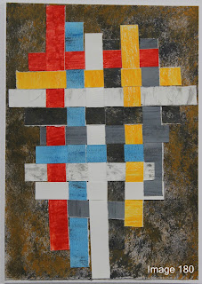
Image 180 - Random colour weaving with coloured papers. The background is one of the papers.
Observation: as I suspected, the red and yellow are very dominant colours and they will need to be used individually/carefully or they will overwhelm the design.
Image 181 - A little tweak which came from the previous work on boro-type samples. As the colour of the sea (the blue colour) is changeable depending on the weather, I used paper printed from an indigo sample I had made and produced this image. I prefer this blue and it is more in keeping with my designs, so if there are no objections I'll use it.
Image 182 - Colour circle - one I prepared earlier!
Image 183 - The chosen colours were placed on six painted backgrounds. They are in the sketchbook with my least favourite first. On analysis, the reason for this choice is probably based on several factors. When you look at my chosen 'colours', there are actually only three true colours - red, yellow and blue (in these samples the ochre on the wall colour swatch is not pronounced) and the colours on which they sit most agreeably are those that are either complementary of harmonious with these three colours. The colour I prefer is a shade of the blue already present. The green background is harmonious with the 'scary' eye colour - nature knows best.
Images 184 - 186 - each colour on 'theme related' backgrounds.
Image 184 from left to right - denim, shelf lining silicon and magazine.
Observations: all work well. The denim ties in with the boro theme, the silicon could imply work on a knotted structure and would work well and complement the shadow theme. The water, with the shimmer from the light on the surface, also has design possibilities.
Image 185 from left to right - wallpaper, tissue coated with acrylic wax, magazine coated with acrylic wax and baking parchment coated with acrylic wax (hole cut through page).
Observations: Of all the backgrounds, the wallpaper is the least successful due to the sparkle. The translucent/opaque nature of the acrylic coated tissue and baking parchment also have shadow design possibilities.
Image 186 from left to right - baking parchment coated with acrylic wax, crepe paper, calico, dish cloth, wallpaper, heavy cotton with chevron pattern.
Observations: all work well. The dishcloth cotton has a look of feathers. This could be useful when making the papers ready for design work. The texture of the crepe paper is also pleasing, though the colour is a little brash for the theme.


