Wednesday, 17 February 2021

Diploma Module 3 Chapter 9 - Designing - Option A - 'Over the Edge'

When I started reading this chapter my work from Module 2 Chapter 6 immediately came to mind (was it really November 2017!).  So I revisited Decorative Details from a Shisha Textile, particularly the results from prints on tissue paper taken from a gelli plate.  Three designs were selected which I hoped would give me scope for an interesting extended design.


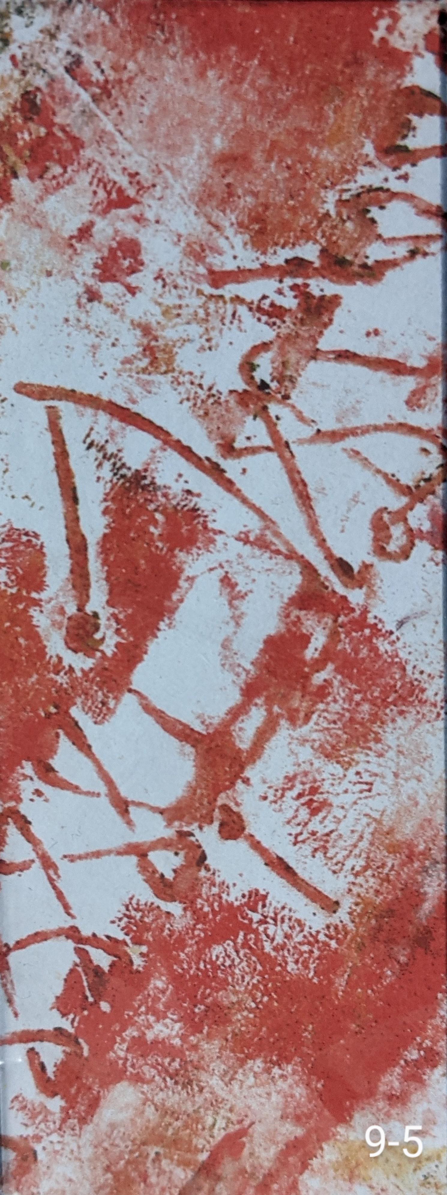
On acetate sheet I made a rectangle 4x10cm and found four sections on these designs that caught my attention:


I decided to work with 9-7 (from 9-3).

First stage

9-8         The small section was positioned vertically on A4. Masking tape with torn edges of different widths was placed vertically to extend the lines containing the 'stitches'.  Ochre acrylic was dry-sponged on the extended surface and also drag-rolled with a printing roller.  Red oil pastel was rubbed over a textured mat covered with raised circles to form larger red circles.  Additional lines were added at 90 degrees to these circles mimicking the original pattern.


9-9    The masking tape was carefully removed revealing parallel lines of different widths  and the 'stitches' were added over these using the brush tip of two ErgoPro alcohol based Illustration Markers in saffron and caramel.  


9-10    The white round the 'stitches' was cut away using a scalpel.  This is going a little 'off piste' but it is snowing outside and it gave me the opportunity to try layering different colours with the design, 


9-11    The cut design places on a backing made from Anthropologie tissue (I love the colour) PVAd onto paper.  The design no longer 'pops' but becomes muted.


9-11    The cut design was placed on tea bag 'sponged' paper. This had a similar effect on the design as in 9-10.


9-12    The cut design was placed on a backing made from red tissue PVAd onto paper.  The red alters the focus of the design to the 'stitches' and is rather overwhelming.


9-14    The cut design was placed on a piece of silver tissue to evoke elements of the shisha mirror.  Once gain the design loses its 'pop'.


9-11 to 9-14 were interesting experiments but I still prefer the clean lines of the white in 9-10, preventing the design from being deadened, overwhelmed or altering its integrity.

Second Stage

9-15    The new A4 design was placed an angle on a piece of larger, A2, paper.
    

9-16    Rather than immediately start extending the design with different media, I experimented with different design line drawing layouts using the S pen on my new toy, a Samsung Galaxy S6 Lite (well what  else can you do in Lockdown and Snowdown!).  This was similar to the way I had worked on photocopies of a constructed background quickly sampling possible ways of stitching on paper before getting my needle and thread out.  This one I thought was a little busy.


9-17    This one has lost the structure of the original.


9-18   Getting better but the right hand side was too light weight and so the design was losing balance.

9-19    Better.  I decided to go with something like this layout.


9-20    Extended design.  Masking tape, acrylic - added with natural sponge, silicon pastry brush and printing roller, oil pastel and the two ErgoPro markers as before.


9-21    Looking at the design, there was one part of it that didn't work - is circled in black.  On my quick line drawings, the left hand section contained smaller shisha-like circles and I shouldn't have strayed from this. This large broken curve is too dominant and removing this section and replacing it with a smaller circle would  give me a more satisfying design.


9-22    More like this.  However, given that small sections of the final design will be taken this probably isn't an issue.


Third Stage - Take a Portion

I looked for interesting portions of this design using first using the Google editor on my phone 


and then in Photoshop Elements on my laptop, a more powerful editing tool.  Images were sometimes rotated.  Image 9-34 is a transformation of Image 9-30.


Looking at the above images, it became apparent that the images that caught my attention were not necessarily those that contained say 'stitch' detail, but those that had interesting surface marks from the the way in which the different media has been applied to the paper.  It wasn't until the design elements began to blend into the overall design that they became appealing, as in 9-29.

9-34 was the design I decided to take further and redrew this (9-35).


9-35    The colours on the design were built up in layers using Windsor and Newton Art Masking Fluid for water colour,  SeaWhite's medium yellow acrylic applied with a sponge and red oil pastel.  I decided to go for a brighter yellow as I felt the colours were becoming rather drab.  The media used I hoped would create interesting marks.  The masking fluid was removed in two ways, in some cases with a silicon rubbing tool sometimes it was scratched off with a scalpel and the oil pastel was manipulated/scratched with the scalpel at the same time to reveal the yellow beneath.  In the way the media were applied I tried to get an underlying movement into the design from the bottom right to the middle left and the to the top right of the design

Fourth Stage

Using this design I drew up plans to make a curved shape to contain an LED light strip, making it in a similar way to making a light box.  The design chosen has lost the 'stitched' element but this could be used to attach the various sections of the design together (9-36).  These inserts would cast interesting shadows when the shape was illuminated.  From previous experiments (6-68), this could be make from waxed calico and holes to stitch into could either be cut, or made using an awl or a hole punch.  As the sections were waxed, they could be curved before the wax dried to give an interesting shape.


Using Photoshop Elements I tried various combinations of shapes, sizes and orientations  that could make up the curved light 9-37/9.  


Of the above layouts I probably am drawn to 9-37 the most, but sadly even that is too busy.

Fifth Stage

From the enlargement 9-35 a further section was taken and different colourways were tested on this section using Photoshop (9-40/3).


A smaller section of the above design was taken...
and...
I knew if I kept enlarging sections for long enough the gulls would fly in!!! (9-44).  Welcome back.


In terms of my research, this is the section that probably ties in most to my body of work. It is also the design most in line with the things that appeal to me: its strength lies in its simplicity. 

Taking a step back I remind myself of what draws me to a design:
  • a neutral/limited palette with little splashes of colour
  • non-symmetry
  • layers of pattern and shape
  • ripped/cut edge
  • changes in scale
  • introduction of quiet space - keep it simple.
I was going to finish this section here but...

9-49    I redrew 9-44 in selected colours from my palette using oil pastels in white grey black yellow and red.  Then layer upon layer of Golden Open acrylic in Prussian Blue were built up for the background.  On top of the pastel on the wings I added Koh-i-Noor dyes in grey and black and then scratched them with the blade of a scalpel to build up texture.  When I was happy with the result I played with the images in Photoshop.


9-46    Distorting multiple images in Photoshop horizontally.


9-47    More image distortion and varied placement of images in Photoshop.


9-48    9-47 with image separation.


9-49    Simple 'stitch' marks on 9-48.


Looking back on this chapter, my preferred designs here are leading to an assessment piece that is probably a panel.  I still like the idea that it could incorporate an LED strip to make the most of shadows created by either lines of joining stitch or cut outs, rather like a light box.  The fact I reverted to my design theme of  'gulls with an emphasis on shadows' and my chosen colour palette in the later images is probably an indication I wasn't invested enough in the design originally chosen for this chapter and where it was leading.  Even 9-49 is too busy for me and an enlarged panel could incorporate constructed pieces but on a larger scale than used in my resolved sample 6-67 to give simple but interesting quieter space between the main design focus.


Sunday, 7 February 2021

Diploma Module 3 Chapter 8 - To The Edge

SECTION 1

Using what was readily available, the fabric in my samples is 'Melbury', adapted from a Sidney Mawson design by Liberty of London.  It is a heavy-weight, flame retardant upholstery cotton with a prominent large design of a pomegranate tree, plus other smaller details of leaves and berries in a rich Autumnal colour palette (8-1).  I chose strips that had both large and small scale design elements.  Though not as clearly defined as the given example I hoped they would give me enough scope from which to extend the design.

Four strips of this fabric were extended onto plain paper using various media (8-2 to 8-5).


Media in the above edge designs included Koh-i-Noor wax aquarelles, Inktense pencils, both dry and dry-on-wet, Ergo Pro ink brush, permanent sepia fine line marker, oil pastels, wax candle, damp tea bags, metallic Gioconda Artist Leads and acrylic wax.

SECTION 2

Turned Edges

8-6    Turned edge padded and stitched


8-7    Turned edge bound with padded contrasting fabric then embellished with French knots mimicking the design on the pomegranates on the Liberty fabric.

8-8    Selected parts of the design machine stitched and then the edge turned. Shapes cut from  the design on the turned edge.  The turning formed loops through which sari silk strips have been threaded.

8-9    Even weave linen with drawn threads and frayed edge which has been turned over a painted bamboo stick and then held in place with single faggot stitch (diagonal square stitch).


Bound Edges

8-10    Edge folded and bound with plain fabric and design detail inserted in the binding.


8-11    Drawn thread channel turned and bound with design detail.  Surface French knots (on seeds) to hold the applied details in place.


8-12    Fabric edge frayed and then folded on drawn thread section.  Into the fold a contrasting frayed fabric is inserted which is held in place by hand kantha stitching .


8-13    Even weave turned and bound with design detail.  Sympathetic back stitches hold the turning and applied pieces in place.


8-14    Frayed edge turned and bound with design detail.  Surface hand stitching holds the turning in place.


Faced Edges

8-15    Shaped faced edge free machine stitched in contrasting colour and then cut close to the stitching.


8-16    Two fabrics turned 'inside-out' after inserting design detail (leaves )into seam before stitching. The leaves were then mirrored in free machine embroidery (note, you can see the faced edge in some places - careful pressing is needed if this is not the desired result).


8-17    Two layers of fabric were padded and then stacked to form multiple layers.  Cut shapes from the design also echo the repeat pattern.

Frayed Edges

8-18    Even weave with drawn threads that have been woven with contrasting threads, enclosed in borders hand stitched in single faggot stitch (diagonal square stitch).

8-19    For this sample I returned to the Manx Crosses theme as inspiration.  From even weave I created three layers

  • bottom layer - piece of frayed even weave
  • second layer - piece of frayed even weave with deeper frays than bottom layer.  This was then divided into 'clumps' by plaiting pairs of threads
  • third layer - the withdrawn threads were plaited and placed on top of the second layer and held in place top and bottom with small stitches, creating a channel.

This created various possibilities (see 8-20-22).

8-20    A piece of black linen bias binding was frayed on both edges.  This was inserted between layers one and two of 8-19.

8-21    The bias binding was placed on top of layer 2 and under layer 3.

8-22    The bias binding was threaded through the channel created by layer 3.

Ruffles

8-23     A bias strip was cut and one of the long edges was machined using the automatic stitch pattern #16 on my Bernina, which gave a scalloped edge.  The material was then folded in a ratio of about a third to two thirds and machine gathered on the folded edge.  This was machined to a piece of calico and then the longer edge was frayed.       


8-24    Again using bias strips, the edges were stiched with automatic stitch pattern # 13. They were gathered at an angle down the strip and machined to a piece of calico.  This was repeated, placing the strips at different angles.  


Flounces

8-25    Three 22cm circles were cut from calico and then from inside this circle 
  • a 12cm offset circle was cut (8-26)
  • a 12cm circle was cut from the centre (8-27)
  • a 17cm circle was cut from the centre (8-28)
All were then cut to give a strip of fabric which was machine to calico to produce the  different flounces shown in the pictures below.


Stitched Edge

8-29    These were made using heavy duty hot water soluble film.  Image 8-29/30 replicates 8-16 but with this technique, the stitching being extended past the edge onto the film and then the film dissolved.


8-31    The edge of the fabric was machine stitched as in 8-17 and then the fabric was trimmed to the stitching.  In the 'gaps' formed, the pattern was extended past the edge onto hot water soluble fabric.  Once complete, the soluble fabric was dissolved.             


Folded Stitched Edges

8-33    This sample was inspired by the carnation stems and leaves from the Melbury fabric, interwined and overlapping.  The design was extended past the edge onto hot water soluble fabric and then onto a parallel piece of fabric. The soluble fabric was then dissolved and the fabric folded in half to give a decorative edge - 8-34.  (Note I didn't continue the pattern on the bottom piece of fabric in the detail I had done on the top as once it is folded over it won't be seen.)


8-35    This sample is based on the plaiting found on Manx Crosses using the technique above.


SECTION 3

Using the edge design 8-2 from Section 1 as a starting point and after some adaptations I made the textile edge 8-38.  The edge is made up of several layers, from top to bottom

  • three wired scuptural forms inserted through holes made using an awl in the second layer
  • three applied semi-circular faced shapes in calico.  The design was free-machined and the shapes were calico-faced.  Sheer flounce edges were inserted when the facing was applied.
  • a plain calico flounce
  • a sheer flounce with distressed edges
  • a second calico flounce with cut outs of leaves, the outlines of which were free- machined
  • a second sheer flounce.
All these are attached to a free machine piece of fabric with a simplified design interpreted from the original Melbury fabric in 8-2.  The colours were altered to use materials I had available.